Description of the series
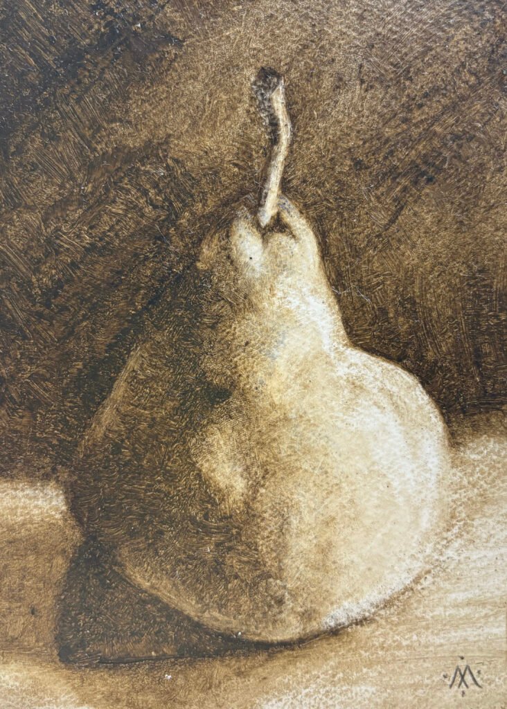
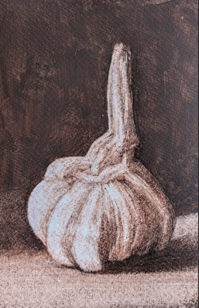
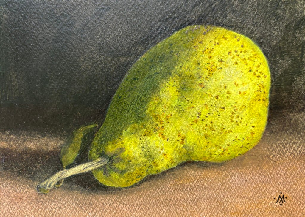
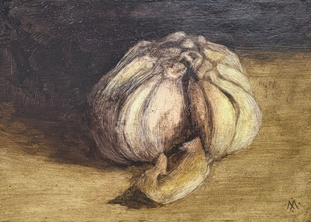
This series of “vegetable icons” depicts individual fruits and vegetables. The series was created in late 2024. These are small (5×7 inch) paintings in oil on paper, made using a subtractive technique. That technique, along with the interaction of the oil paint with the primed paper, create an unusual visual texture with a sense of illumination and mystery.
Inspiration and Intention
Sometimes I see a painting or drawing of a fruit or vegetable that seems, to me, somehow just a bit mysterious. Often it is a rather simple depiction, maybe of a single fruit. It might be in a window sill, with light coming in. Or not. Some of Bill Creevy’s pastel still lifes affect me like that. Juan Sánchez Cotán achieved a similar effect, in a totally different style. I wanted to do something with that sense of mystery. There was something there, something that I wanted to work with. But I didn’t know how. I didn’t want to copy the style of these works. But there was something there that I wanted to express, in my own way. Something that these works pointed to. After a while, I noticed that I had begun thinking of these works as “vegetable icons.”
Finding a Working Method
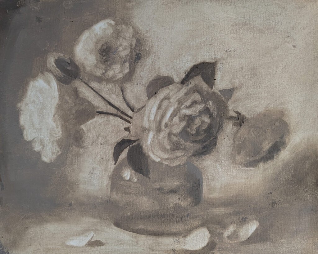
For more than a decade, I noticed this impulse, but did nothing with it. Then, working on other things, I began to experiment with wipe-outs. To make a wipe-out, you first cover your support with a solid layer of oil paint, usually a single, neutral color. Then, while it is still wet, you wipe the paint away to create highlights. You can use a rag, a brush, a cotton swab, your fingers—whatever suits. It’s an upside-down-and-backwards way to paint, that plays with your mind and provokes new insights.
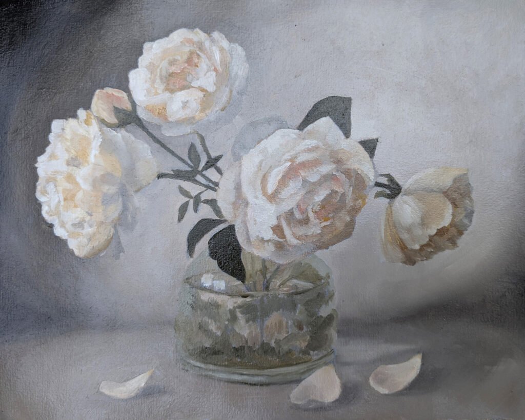
It’s also a very traditional way to establish the value structure of a painting, its pattern of lights and darks. Often, a mid-tone neutral is used for wipe-outs, establishing the pattern of values but not the full range of lights and darks. (Below, one of my own floral paintings: in the wipe-out stage and as a finished painting.)
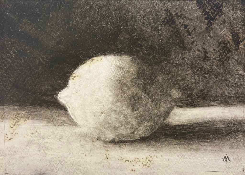
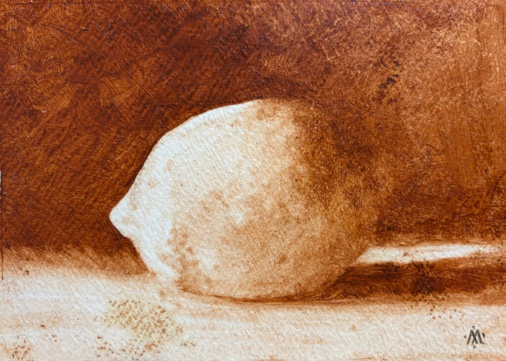
I was intrigued with the look of the wipe-outs. They have a rough directness and a certain sense of mystery. I decided to try some wipe-outs with full-strength dark oil paint. I produced a lemon using ivory black, then a lemon using burnt sienna. I was working on paper that was imperfectly primed, so there were places where the paint soaked through into the paper. This seemed to add to the mystery. They had character, and a certain odd luminosity. I was onto something interesting—and it was something that reminded me of the “vegetable icon” aspiration.
Experimenting with the Technique
I began to make more. I gained considerably more control over the technique. I used this technique to make a couple of more refined still lifes that were not “vegetable icons.”
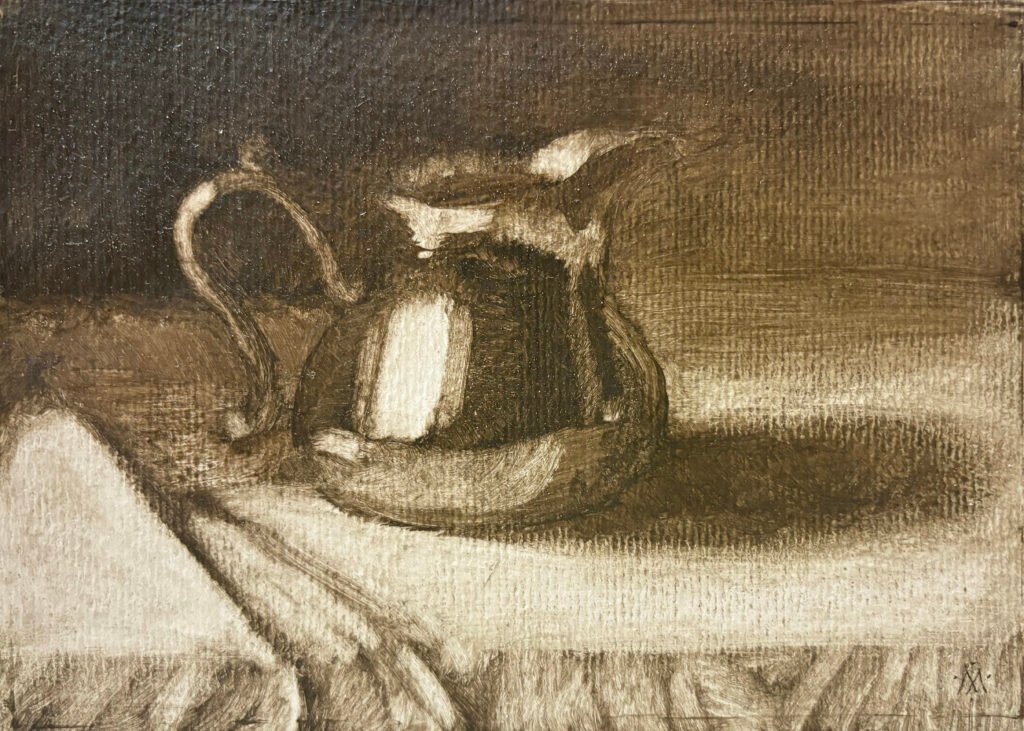
I also tried glazing a couple of these paintings with thin veils of transparent color.
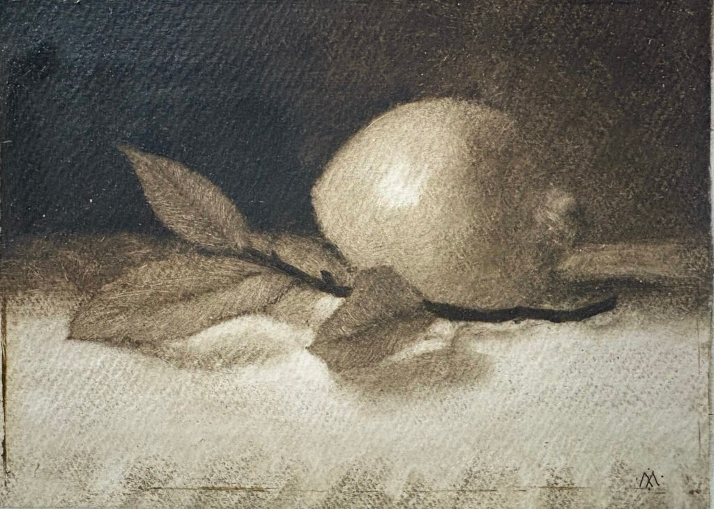
But I think I prefer the less carefully wrought examples, without the addition of color. I tried tinting key areas of the paper before applying the oil paint. I tried scratching after the paint was almost dry. These moves seemed in line with my original vision.
Presentation
My first series of “vegetable icons” is currently framed in hand-oil-painted frames, using the same pigments used for the image. The framed size is 6 3/4″ x 8 3/4″.
You can view these “Vegetable Icons” on my Portfolio page under Collections > “Series: Vegetable Icons Series I.”